


Recently I was asked by a customer to assist in producing a report that details the number of emails sent over the past year to leads and to contacts. As I worked through building the chart, I realized that this could be a helpful metric for others to have, so in this blog post I will walk you through how to build the chart within Dynamics Customer Engagement. I would also like to say a huge thank you to the awesome Dynamics community and especially to Ryan Maclean for helping me this chart! While building out the chart, I ran into some roadblocks and Ryan graciously assisted me, again proving that when in doubt, reach out!
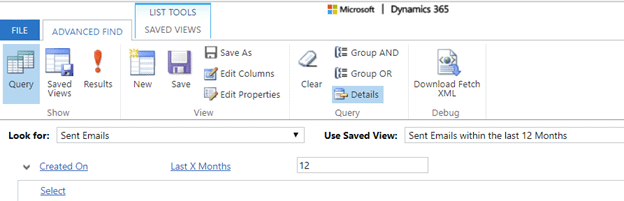
To start, let’s look at the records we need to reference to generate the correct chart. When we send a bulk email, we create an individual record called a sent email for each individual we send to, regardless of whether they are contacts or leads. With that in mind, the first thing we need to do is build a view to show all sent email records that suit our criteria. It is perfectly fine to skip this part if you want to report against all sent emails. In my case, I only wanted sent emails from the last year, so my view looked like this:
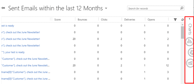
Now that I am looking at the correct subset of data that I want to report against, I’m going to start thinking about what data I want to display on my chart. To access the chart builder, click on the Charts section to the right of the grid:
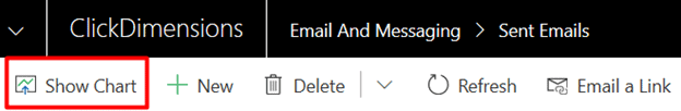
If you are using Unified Interface, this option can be found in the ribbon under Show Chart:
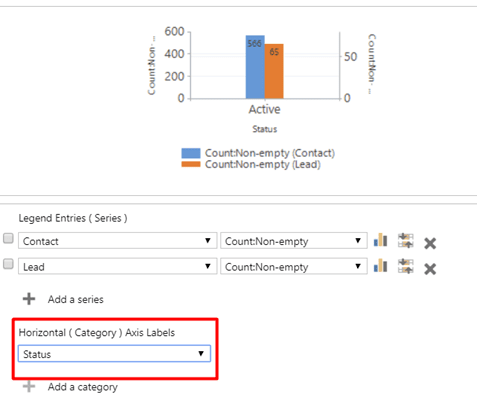
Click on Create New Chart and this will open the chart designer. The chart designer will look the same for both Classic and Unified Interface. First, I am going to select what I want to count. Since I want to count records with two different identifiers, I will add two series to the chart. One for contact and one for lead. Note that I have also selected to only count records where the value for these fields is not empty.
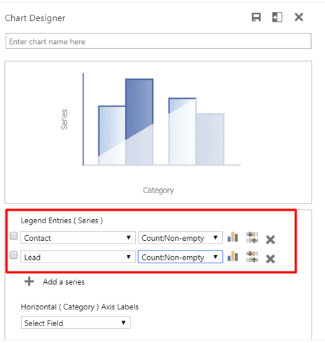
Now that we have determined what we want to count, we now need to tell the chart what value is common between these record types. This part was a little tricky as I needed to figure out what field value would be common between all record types. As all sent email records will have a status of Active, I chose to use the category of Status.
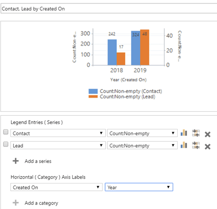
Another useful category, especially when we’re looking at emails over the last 12 months would be the Created On field by Year. Since the last 12 months includes 2018 and 2019, we get a nice breakdown of the data.
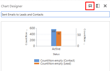
Once you have built out your chart and are happy with it, give it a name and click the Save icon in the top right corner of the Chart Designer.
Once the chart is saved, close the designer and you will see your chart appear in its place. You will also notice that as you switch through views, the chart will change to display the data in accordance with the view shown.
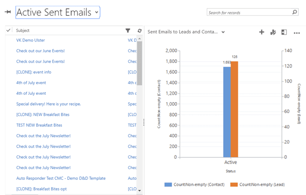
However, you will also notice that our value for sent emails to contacts is higher than sent emails to leads, but the orange bar representing leads is higher than the blue bar representing contacts. This is because we now have two axes on our chart. To fix this Dynamics issue, we need to export the chart, make some minor modifications to the chart code and reimport it.
There you have it! Now you can see the breakdown of your sent emails by contacts and by leads at a glance.

Related Resources

How Sales and Marketing Alignment is your Key to SMB Success
Many small to medium businesses (SMBs) often grapple with one common challenge: disjointed sales and marketing communications. This misalignment can lead to missed opportunities, frustrated customers, and ultimately hindered [...]

How to Improve your Account and Buyer Insights
Understanding your target accounts and buyers is critical in today's competitive business landscape. However, many small to medium sized businesses (SMBs)face one common hurdle: the absence of comprehensive account [...]

Navigating the Sales Pipeline: Top 5 Challenges and Solutions
A well-managed sales pipeline is the lifeblood of any successful sales operation. However, it's not without its challenges. Small to medium sized businesses (SMBs) with well-defined sales processes and [...]
")
