


I am sure many of you have seen your fair share of bad graphic design and have thought, “I can create something better than that!” While it may seem easy enough to just jump right into creating, there are a lot of techniques involved in a making great design. To help you get started, here are a few key rules to follow to make your next design successful!
1. Consistency is key. One of the key components of branding is maintaining consistency. When working on a new design, consistency is important because you want your brand to be easily recognizable across all your marketing and advertising materials. Whether it be an email, ad or even a landing page, your target audience should be able to clearly associate it with your company. For example, most of the marketing materials we use for ClickDimensions follow the same branding that is seen throughout our website.

2. Simplify your color palette. Colors are integral in creating a good design. When choosing a color palette for your design, not only is it important to adhere to your company’s brand guidelines, but also to be mindful of choosing colors that aid and improve readability of your content. Using contrasting colors is a good way to make sure your information is clear. For example, it is easy to read white text on a dark background versus a light background. Another thing to be mindful of is the number of different colors you are using. You don’t want to include so many colors that your viewer is distracted or confused.
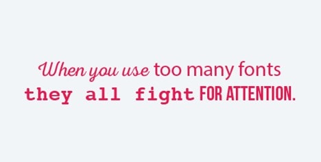
3. Choose the right fonts. Although it is called “graphic design,” most design work is working with text. It is rare that you will see an ad or design with only images or photographs in them. To clearly convey your message, text is essential. Choosing the right fonts isn’t quite as easy as just choosing one that you think looks good. Ornate and hard-to-read fonts can take away from the actual words on the page. You will want to choose a font that is simple and legible. Another good rule of thumb is to limit the number of fonts you use in order to avoid confusion. One way to do this is by picking a font that has different weights (such as light, medium and bold) so you can emphasize and create interest without cluttering up your design.
4.Embrace white space. Speaking of cluttering up your design, the last thing you want is for there to be so much going on that it distracts the viewer. This is where white space can be a valuable tool. White space refers to any section of unused space in a design – not necessarily just a white background. It creates hierarchy and organization while also giving other important design elements space to breathe. If there are too many things crammed into a single design, the viewer doesn’t know where to look and will probably miss the message you are trying to convey.
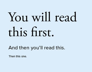
5. Establish a visual hierarchy. While talking about the importance of white space, I mentioned the idea of a hierarchy. To create a hierarchy, designers arrange text, images and other design elements in order of importance. This technique allows you to emphasize information that you want your viewer to notice first. For instance, the following example demonstrates how your eye moves through the design.
6. Look for design inspiration everywhere. While it is easy to get caught up just plugging away at projects, it is also important to look at design work around you. Apps like Pinterest make it easy to create boards filled with inspiration to refer to when creating new designs. Another idea is to have a folder in your email that can be used to save emails or content that you receive that you like. Keeping an eye out for good design around you will not only keep ideas flowing but will also help you sharpen your own skills.
Happy Marketing!

Related Resources

How Sales and Marketing Alignment is your Key to SMB Success
Many small to medium businesses (SMBs) often grapple with one common challenge: disjointed sales and marketing communications. This misalignment can lead to missed opportunities, frustrated customers, and ultimately hindered [...]

How to Improve your Account and Buyer Insights
Understanding your target accounts and buyers is critical in today's competitive business landscape. However, many small to medium sized businesses (SMBs)face one common hurdle: the absence of comprehensive account [...]

Navigating the Sales Pipeline: Top 5 Challenges and Solutions
A well-managed sales pipeline is the lifeblood of any successful sales operation. However, it's not without its challenges. Small to medium sized businesses (SMBs) with well-defined sales processes and [...]
")
